In recent years, Johns Hopkins Medicine has grown increasingly sophisticated in its use of patient safety and quality dashboards, not just to spur internal improvement efforts but also to increase transparency with the public about our performance.
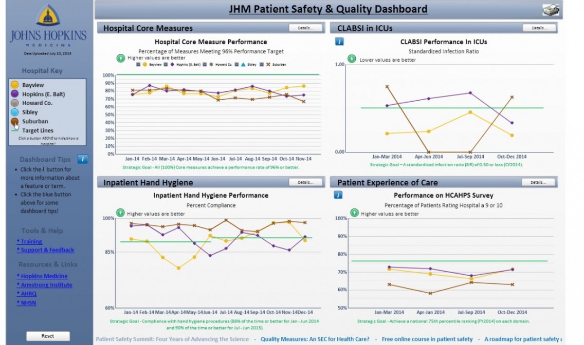
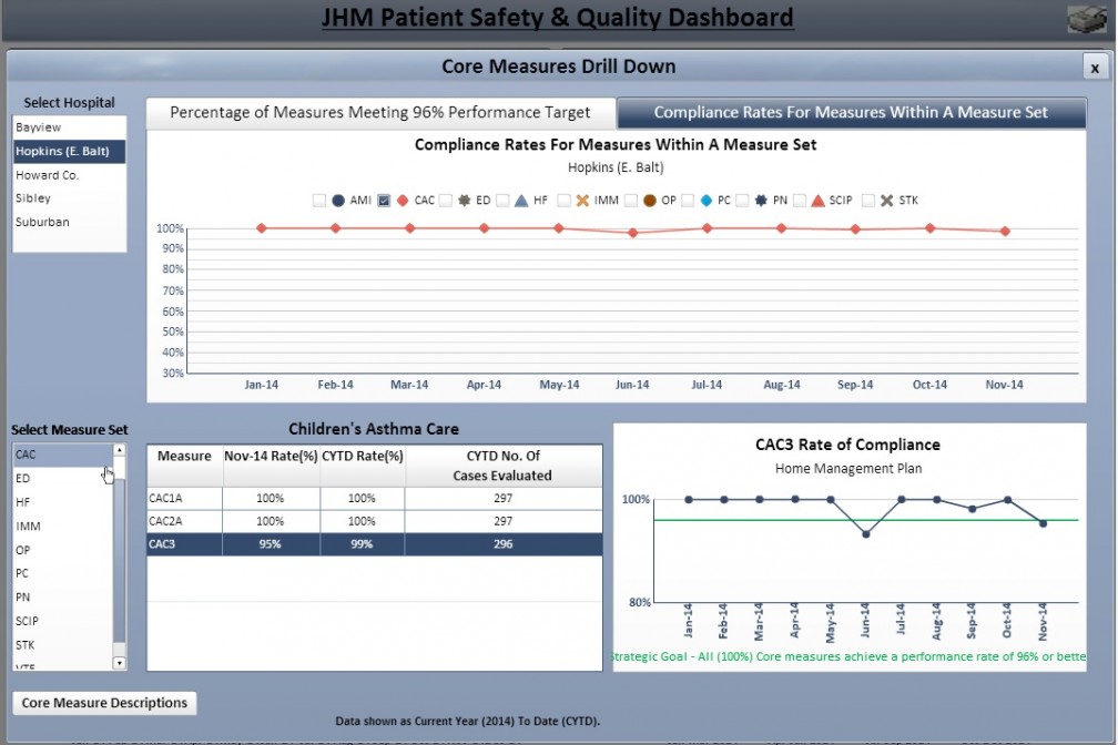
In 2013, we launched an internal dashboard for our health system’s 41,000 employees, sharing our performance data on hospital-acquired infections, hand hygiene compliance, CMS/Joint Commission core measures and the national patient experience of care survey. Now, employees can view performance data for their unit, department and hospital, and compare it to organizational goals. (See screen shots at the bottom of this post.) Meanwhile, they can tap resources for improvement, including access to best practices from across the health system.
Since performance can vary as much between units within the same hospital as between different hospitals, we believe it's critically important for employees to be able to access a local view of how their work areas are doing. And it can spur friendly competition. This is the initial set of measures, and we have plans to add new ones.
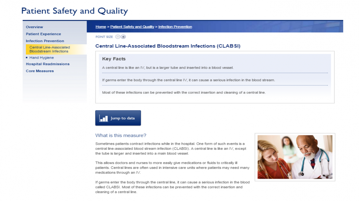
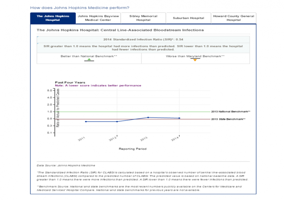
Last April, we launched a website to share hospital-level data with the public. We are sharing our performance data on hospital-acquired infections, hand hygiene compliance, patient experience, 30-day readmissions and CMS/Joint Commission core measures. Here, too, we plan to add more measures in the near future. The aims of the site include making our data transparent to our patients, their families and the communities we serve; consolidating our data in one place so patients don't need to search multiple sites; and allowing us to educate our patients about these measures and what Johns Hopkins Medicine is doing to improve our performance.
Certainly, having the right technical support, such as skilled Web developers, is key for these projects. Yet perhaps the most significant hurdles are cultural, organizational and political. This is tough work, and it can turn your six-month project into one that requires 12 or 18 months. The upside is that this process — doing things "with" people rather than "to" them — can improve the end product while increasing engagement with dashboards.
Here are some of the key challenges we've experienced.
Reaching Leadership Consensus
If you ask leaders of your hospital or health system separately about what data they are comfortable sharing, you will get a range of answers. Some will want to show every result, good or bad, hoping that the reporting itself will spur improvement. Others will take a more guarded approach, worried about the organization's reputation on public-facing sites. Naturally, there will be worthwhile debates about which measures to display. Unless these questions are resolved at the highest levels, the effort to share data transparently will be stymied from the beginning.
This was a bigger issue for our external quality and patient safety site. We were able to find common ground by deciding to initially stick with measures that, for the most part, were already publicly reported on other websites. The exception was our internally tracked hand hygiene data. Now, roughly 10 months since the site launched, we are working to add additional data that patients cannot find elsewhere.
Building Trust with Data Stewards
Perhaps the most critical challenge was gaining the buy-in and trust of those who have traditionally "owned" the data and the initiatives to improve it. Naturally, they may feel protective of “'their" data and have concerns that it will reflect poorly on their work, even if they are performing well at the time. They may be leery of an ulterior motive to put them in a virtual town square and flog them for missing a certain target. They may make the well-reasoned arguments that the numbers don’t truly reflect how we're doing and that the nuance is hard to communicate.
Here, we learned the importance of engaging the data stewards as co-creators, helping us to decide what data to share, how we describe the measures to the audience and the narrative that surrounds the data, such as how we’re trying to improve. While it added time to both projects, the co-creation approach has built trust.
Creating Systems to Share Metrics
As a whole, health care organizations lack mature systems for sharing quality and patient safety data across the enterprise. We continue to keep data in silos, sequestered in different formats by various departments. In addition, different data keepers must provide the results in different ways for various reporting initiatives; government agencies, hospital boards and other groups all have requirements for how they want to see data. For the dashboards, we decided to keep reporting periods similar across different measure types, sticking with quarterly updates.
Through the process of putting together a dashboard, you can also identify opportunities to improve the accuracy of your data collection process. For instance, we found that hand hygiene data would be recorded in different ways — "Halsted 4" and "4 Halsted" referred to the same unit. We had to standardize how the data was entered.
Involving End-Users
For our internal dashboard, we could have done a better job of understanding what our end-users — health care professionals with Johns Hopkins Medicine — wanted to see. While they liked the ability to compare their unit against benchmarks or goals, we repeatedly heard that they wanted to overlay the performance of their unit against that of others — for example, a surgical intensive care unit versus a medical intensive care unit, or a surgical intensive care unit in another Johns Hopkins-affiliated hospital.
In building the external-facing site, we actively engaged the Patient and Family Advisory Councils across Johns Hopkins Medicine. We shared early prototypes of the site and asked for their input and feedback. We thought this input was crucial, given that our goal was to create a site that our patients and their families could use and understand.
Navigating a Lengthy Review Process
Expect to spend many hours in meetings with hospital and health system leaders, clinical directors, quality and safety-related committees, and other stakeholders. For external-facing websites, use patient and family advisory councils and other groups to gain end-user feedback. You will receive a bevy of ideas for site design, usability, readability and what measures to include, to name several. You will be able to accommodate some ideas. Some, you will not. But the process should make the end result stronger while increasing engagement of with the dashboard before launch.
And perhaps that is one of the best outcomes of taking a deliberate, inclusive approach to creating your hospital dashboards: When complete, they are less likely to be seen as the pet project of your quality department or technology specialists. They will emerge with greater support of hospital leaders and stakeholders, with all eyes looking to the dashboard as a legitimate gauge of performance, for which they will hold themselves accountable. And that supports our ultimate goal: using data to spur improvement.
Read More:
- "Putting patient safety and quality data where you might not expect it: Johns Hopkins Medicine goes performance-transparent with dashboards" (Becker's Hospital Review)
- "Inform and educate" (Hospital Risk Management Review)
Internal Patient Safety and Quality Dashboard
Click on images for a closer look.
External Patient Safety and Quality Website
Click on images for a closer look, or visit the site directly.